PROVING WHO YOU ARE, WITHOUT HANDING OVER EVERYTHING
alongID: a digital identity wallet, taken from proof of concept to a dev-ready product
Role
Lead Product Designer, sole product designer
Industry
Digital Identity / Fintech
Timeline
December 2024 to present
Scope
Product vision, mobile wallet, design system
Platform
iOS, Android
Status
First partner release planned for end of August 2026

In 60 seconds
A digital identity wallet. Your ID, passport, phone, email and KYC checks, held by you and used to prove who you are when a bank or a platform asks.
I'm the only product designer. I own the vision, the wallet, and the design system.
Nobody has ever used this product, so nobody trusts it yet. That is the design problem. Not the flows, not the visual language. Every screen either earns a piece of trust or spends one.
So this case study is organised the way the product is: as seven trust signals, and what each one cost.
The most expensive was the visual one. Our founders announced at MWC Barcelona in March 2025 before we had a brand. The feedback wasn't about usability, it was about taste. Too colourful, not premium enough. In an identity product that is not a cosmetic note, it means not credible enough. We rebuilt.
No launch data yet, so the last section is what I will measure and what would prove me wrong.
The project arc: from proof of concept → wireframes → MWC demo build → revamp → dev-ready MVP.
Trust is the product, and the product is invisible
alongID is a wallet for verified identities: ID card, passport, phone number, email address, KYC and KYB checks. You use them to prove who you are when you open a bank account, and eventually when you pass through an airport.
The idea is simple to say and hard to build. Identity is the most sensitive category of data a person owns. The industry that handles it speaks almost entirely in legal and cryptographic jargon. And unlike most products, the thing being sold is not a feature. It is a belief: that handing your passport to an app is safer than handing it to a stranger behind a desk.
Belief cannot be asserted. In identity, "we protect your data" is worth nothing as a sentence. It has to be demonstrated, repeatedly, in small visible acts, by a product the user has never seen before.

alongID solution: One integration. All providers. Reusable credentials.
Three problems that made this harder than a normal 0 to 1
The user has no mental model to borrow from
People understand a wallet with cards in it. They do not understand issuers, verifiers, or what it means for a credential to be cryptographically bound to them.
The length of a journey is set by someone else
A verifier configures its own verification workflow. One might ask for a single ID document. Another might chain a document check, a liveness check, a questionnaire and a KYB step. I was designing a flow whose length I didn't control.
Most of the hard machinery isn’t mine
Document and face verification run on third-party SDKs. The security model lives on the device. My job was to make a system assembled from other people's components feel like one thing that can be trusted.


Seven trust signals, and what each one cost
Trust in a product like this is not a feature you can ship. It accumulates, or it doesn't, across a series of small visible acts: what the product calls things, how much it tells you before it asks, who it says is asking, what it does when something breaks, where it keeps your data, and whether it looks like something that handles passports.
Below are the seven I designed for, in the order a user meets them. Every one of them cost something, and I've said what, because a signal with no price attached is a preference rather than a decision.
Signal 1: The product never says "verifiable credential"
The technical term for what sits in the wallet is "verifiable credential". The product never uses it with a user. It says digital ID card, or simply identity.
This sounds like a copy decision. It was a product decision, and it was contested. The technical term is precise, and precision matters in a compliance context. I argued that precision the user can't parse isn't precision, it's noise, and that legal accuracy could live where legal accuracy belongs rather than on the card in someone's wallet.
The same rule ran through the interface. Microcopy carries the tone here, smart and invisible help alongside a warm, plain-spoken register, and it does more work than any visual element.
The cost
We gave up terminology that maps cleanly to the specification, which means the product's language and its documentation have to be reconciled by hand.

Signal 2: You see the whole journey before the first step
Because verifiers configure their own workflows, a journey might be two steps or eight.
The instinct is to hide that, to show one step at a time and keep it feeling light. I went the other way and showed the entire journey upfront, then guided the user through it one action at a time.
Uncertainty is more expensive than length. Someone who can see four steps and knows where they are will finish four steps. Someone three steps in with no idea whether two or ten remain will quit. Each step carries its own state, so a completed step is visibly settled and needs no further attention, and the single active step is the only thing asking anything of them.
The same component renders a two-step sign-in and an eight-step business account opening. Everything else served speed: the shortest path through whatever the verifier configured, no decorative steps, no confirmation screens that confirm nothing.
The cost
An eight-step journey looks like eight steps, and some verifiers would rather it didn't.

Signal 3: You see who is asking, and why, before anything leaves
Sharing is a deliberate, legible act rather than a background consequence of continuing. The user sees exactly what gets shared, and nothing more.
Underneath that sits a requirement, not a preference. In the eIDAS ecosystem a verifier selects a single purpose when configuring its workflow, for example onboarding or marketing. The user has to be able to see that purpose, and to open the requesting institution's details, where the member state and the registered business number are the minimum we are obliged to display.
I treated that legal minimum as a design opportunity rather than a compliance checkbox. "A company you have never heard of wants your passport" and "an institution registered in Ireland, company number 123456, is asking for your date of birth in order to onboard you" are the same transaction with completely different levels of trust attached.
The cost
This is the part of the product that takes the most screen space and adds friction on purpose, which is a difficult thing to defend in an MVP review.

Signal 4: You are never handed off to a stranger
Document and face verification run on third-party SDKs from Regula, Aware and GBG. The system selects a provider automatically depending on document type and flow.
That is the correct engineering decision and a serious design problem. Being bounced into a differently branded screen at the exact moment you are photographing your passport is a trust failure, and it is the moment users are most alert to one.
My work here was integration design. I read the vendors' documentation and adapted their modules into our system so the user is never redirected and never leaves the alongID environment, regardless of which provider is running underneath. From the outside it is one product. Underneath it is three.
I want to be precise about the boundary: the verification logic and its error handling belong to the providers. The seams, the language, the states and the sense of one continuous product are mine.
The cost
Every vendor update is a design maintenance problem, and the design system has to absorb components I don't control.

Signal 5: When it fails, the product explains rather than blames
Verification fails often, and for reasons the user did not cause and cannot interpret. A passport without an NFC chip. A document that expired last month. A document that isn't valid yet.
The providers handle detection and log every attempt. What the user sees is mine, and I wrote each state to do three things: name what happened in plain language, avoid implying the user did something wrong, and offer exactly one way forward.
Contextual notifications carry the same job through the live parts of the process, selfie, liveness and document scanning, so the user always knows what is happening while it happens.
One thing worth naming: a rejected document is not a rejected person. The failure states are deliberately written about the document, never about the user.
The cost
Every provider error code needs a human translation, and that list only grows.

Signal 6: We never hold your documents, and we can prove it
The strongest trust signal in the product is an architectural one, and my job was to make it visible.
Credentials are stored securely on the user's own device. alongID never has access to them. That is not a policy we ask people to believe, it is a property of where the data sits.
Access is controlled by a PIN set during registration, which the user can later replace with device biometrics. We support only the highest biometric security standard, so a device with a fingerprint reader below that certification cannot enable it at all. That excludes some users from the convenience, deliberately. In a wallet holding a passport, an inconsistent security floor is worse than an inconvenient one.
Recovery had to hold the same property. If a user loses their phone or changes device, they need their identities back, and we still must not be able to read them.
Seed phrases were the answer, and that was a design decision rather than a constraint handed to me. I worked it through with our engineers and our PM, then designed the full backup and restoration flow around it, so the backup lives on the blockchain layer and we still have no access to it.
This is not in the dev-ready MVP. It is designed and specified, and it ships later. I am flagging that rather than implying otherwise, because "designed, not yet shipped" is the honest status.
The cost
A wallet nobody can rescue you from is a wallet where losing your seed phrase is final, and that is a real burden to place on a non-technical user.


Signal 7: Looking trustworthy is a trust signal, and we failed it in public
In March 2025 the founders announced alongID at MWC Barcelona.
We didn't have a brand yet. We had a direction. I built a deliberately limited MVP so there was a working demo for the stage and the floor, and shipped it against a moving visual target.
The feedback that came back wasn't about usability. Nobody struggled to use it. The feedback was about taste: too colourful, not premium enough.
It took me a moment to hear that correctly. In most products that note is cosmetic. Here it wasn't. A product asking people to trust it with their passport cannot look casual. The visual register is not decoration on top of the trust argument, it is part of it, and we had failed it in front of exactly the audience we needed.
Our brand designer iterated on the identity and the tone of voice. I translated that into the product: restraint over colour, a dark-first surface, typographic hierarchy carrying the weight instead of decoration, and a much smaller accent palette used only where it means something. The revamp ran through the whole product rather than being applied as a skin, because the problem was structural.
What I'd do differently
Resolve the brand direction before the demo, or design the demo explicitly as a throwaway. Shipping against an unfinished identity bought us a date on stage and cost us a rebuild. Knowing that MWC would return taste signal rather than usability signal, I would have optimised for one memorable moment instead of feature coverage.


alongID app dashboard (before and after brand styleguide revamp)


alongID identity details sharing page (before and after brand styleguide revamp)
One designer, two products, one system
The wallet is for a person on a phone, mid-task, probably slightly anxious. The self-service platform is for a verifier or issuer at a desk, building a workflow and configuring real-time alerts. Different users, different postures, different jobs.
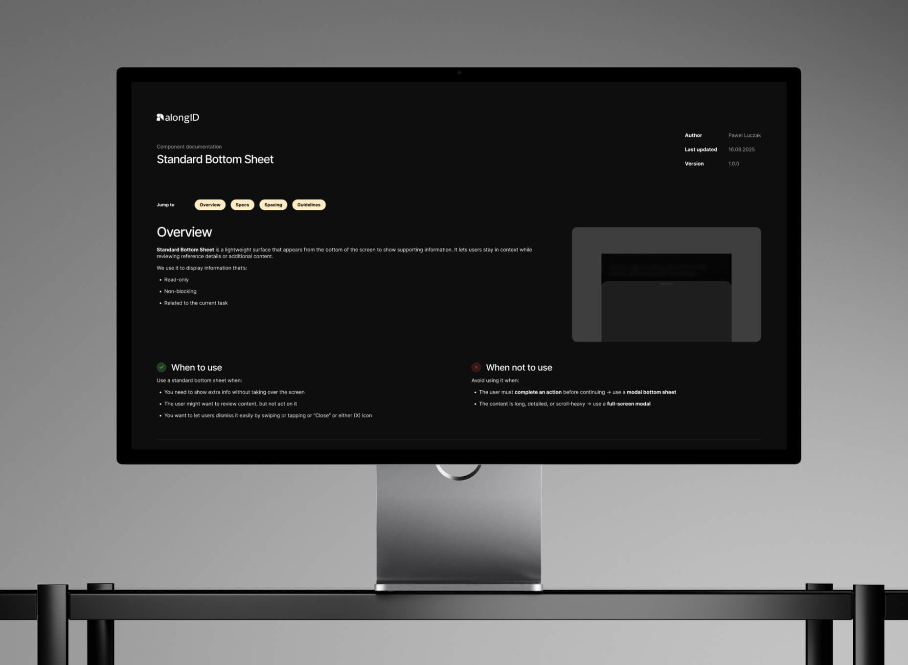
I built them on one design system with shared foundations and developer documentation, so that a change to a state, a token, or a piece of terminology propagates to both rather than drifting. With one designer covering both surfaces, a shared system wasn't an efficiency nicety. It was the only way the two products could stay coherent.
What shipped
Onboarding and first credential
Install to holding a first verified identity, including PIN setup, biometric enrolment, privacy policy and age confirmation.
KYC
Document capture, NFC read, liveness and selfie, running on Regula, Aware and GBG underneath, presented as one continuous alongID flow.
The wallet
Held identities, legible at a glance, in the user's own language. Not a list of cryptographic objects, but a set of things they recognise as theirs.
Verification journeys
The guided path through whatever a verifier configured, with the whole route visible and one action live at a time.
Sharing and disclosure
Requester identity, stated purpose, exactly what will be shared, and a way to decline.
The design system
Components, states, tokens and terminology, documented for engineering, spanning the wallet and the verifier platform.
Designed, not yet shipped
Backup and restoration via seed phrase.
What I will measure, and what would prove me wrong
The product hasn't launched, so there is no adoption data and I won't invent any. What I can do is say what I built this to move, which is the same conversation I would have on day one of the job.
The metric that matters most
Credential reuse rate. The share of verification requests satisfied by a credential the user already holds, rather than a fresh KYC. Everything else in the product is a means to this. If people go through KYC every time anyway, reusable identity has not happened.
Activation. Time to first credential, from install to holding a verified identity. Credential add completion rate. First-pass verification rate, and retry recovery rate, meaning the share of users who fail once and still finish. Step-level drop-off across capture, NFC read and liveness, because those steps have very different failure causes and should never be averaged together.
The core loop. Presentation completion rate, the share of verification requests that end in successful sharing. Time to complete a request. Drop-off by step, segmented by journey length, because that is the direct test of Signal 2. If two-step and eight-step journeys drop off at similar rates per step, showing the whole journey upfront is doing its job. If long journeys collapse anyway, my reasoning was wrong.
The counter-metrics.
These are the ones I would watch to find out I was wrong.
Abandonment at the disclosure screen. Signal 3 is the part of the product I would defend hardest, and it is also the part that adds friction on purpose. If people leave at the exact moment they see what will be shared, transparency is frightening them rather than reassuring them.
Decline rate, reported separately from technical failure. A user consciously declining to share is the product working. If it is counted alongside errors, someone will eventually optimise it away.
Biometric enrolment rate. We deliberately exclude devices below the highest standard. This tells us the size of the group we made that choice for.
Support contact rate after a failed verification. The real test of Signal 5. Good failure states should reduce it.
What I’m taking forward
Plain language is a design deliverable, not a copy pass
Refusing the industry's vocabulary changed what the interface had to explain, which changed what it had to contain.
A legal minimum is a design opportunity
The member state and registration number were an obligation. Presented well, they became one of the strongest reasons to believe the request in front of you is real.
Feedback tells you what it’s about, not what you asked
I went to MWC braced for usability findings and got taste findings. Usability problems are fixed locally. A credibility problem is fixed structurally. Reading it correctly mattered more than the fix.
Trust is made of small visible acts, and most of them cost something
Every signal in this case study has a price: screen space, friction, excluded devices, maintenance. Knowing what each one costs is what makes it a decision rather than a preference.