The clubs weren't broken. Their economics were.
Redesigning Sweatcoin's clubs by changing who pays for them, and lifting daily active users 9% month on month
Role
Product Design Team Manager, sole designer
Industry
Health & Fitness / Partnerships and monetisation
Timeline
January to June 2024, live after testing
Scope
Clubs redesign, branded clubs, activity and mechanics
Platform
iOS, Android
Status
Shipped June 2024. DAU up 9% month on month

In 60 seconds
Sweatcoin had clubs. Any influencer could start one, and thousands of people could join. Prizes were optional and came out of the influencer's own sweatcoin balance, so mostly there were no prizes.
The result was hundreds of clubs offering nothing, and users who had stopped bothering.
I had 1.5 months, one PM, one front-end engineer and borrowed QA time to find out.
The fix was not a visual one. Nobody in the old model had a real reason to invest in a club, so I changed who pays. Brands do have that reason: they buy visibility and reach. A branded club gives the partner a place to be seen, gives the user something worth winning, and gives the product a revenue line it did not have.
I was the only designer, working with a PM, from January to June 2024. First partner was Nike.
Daily active users rose 9% month on month, comparing the period running the old clubs against the period after the redesign.
It also became the foundation for what came next. Once brands had a home in the product, LiveOps campaigns could be sold on top of it.

Why the clubs were dying
Clubs were a good idea implemented on a broken incentive.
Anyone with an audience could create one. Members joined, walked, and competed on step counts. The person who created the club could reward the most active members from their own sweatcoin balance, but nothing required them to, and most did not.
So the product filled up with hundreds of clubs that asked people to compete for nothing. Users tried them, found no reason to stay, and stopped opening the tab.
The brief was to redesign clubs. The real problem was that the model had no funder.
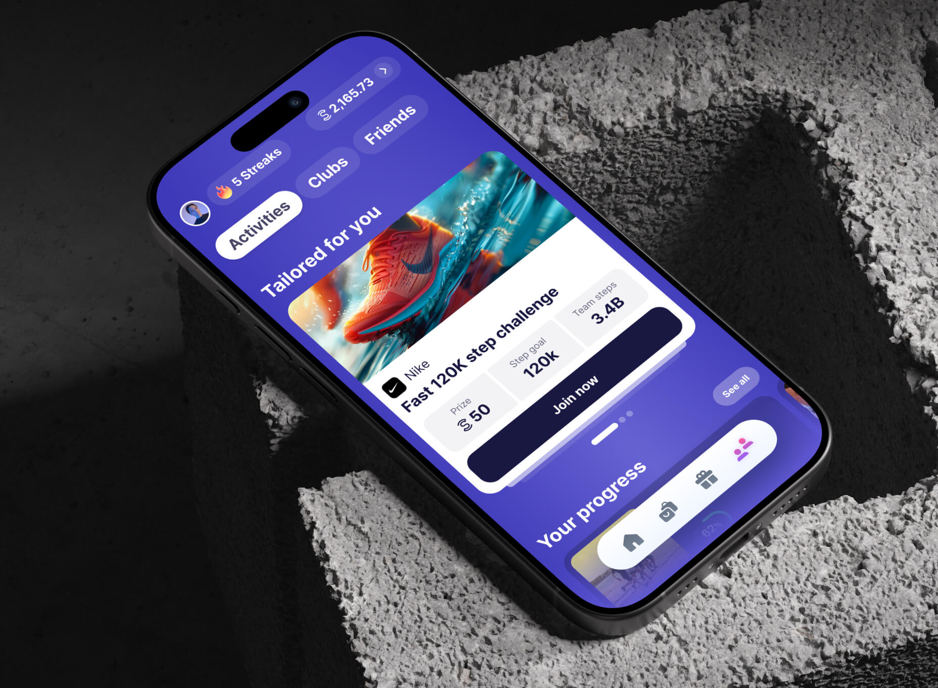
Branded activities once user already joined their club
Six decisions
Decision 1: Change who pays for the club
Context
The old model relied on individuals voluntarily spending their own currency on strangers. That is a generous act, and generosity does not scale into a product mechanic.
What I chose
Replace the funder. A brand buys a branded club, and in return gets visibility, reach into millions of users, and a place inside the app that belongs to it.
Everything else in this case study follows from that one move. The rewards get real because someone with a marketing budget is paying for them. The activities get compelling because the prizes are worth walking for. The clubs get maintained because a partner is invested in them.
What it cost
Clubs stopped being purely community-owned. A commercial layer entered a part of the product that had been social, and users can feel that. Everything after this point is about making that trade honest rather than hiding it.
Decision 2: Make the club the way in, not a wall around it
Context
The partner is buying reach. Club membership is the thing that delivers it, so joining the club has to be part of the flow rather than an optional extra nobody selects.
What I chose
To enter a branded activity you join the brand's club. The prompt is explicit about it: you need to join Nike Official club to join this activity, with the club shown, verified, and a clear cancel.
One toast confirms both actions at once, so the user does not experience it as two separate hoops. A short delay before it appears lets the join animation finish first, which matters more than it sounds when the whole interaction takes under a second.
What it cost
A step between a user and the challenge they already decided they wanted. I could not remove it without removing the reason the partner was paying, so I spent the effort on making it fast and legible instead.

Decision 3: Build a ladder, not a prize
Context
In the old model there was at most one reward, for the single most active member, and usually none at all. That gives almost everyone no reason to continue after the first few days.
What I chose
Three rungs, each aimed at a different moment.
A completion reward in sweatcoins, guaranteed, for finishing the challenge.
A halfway bonus, a partner discount, delivered at 50% progress with a modal that acknowledges the moment rather than just handing over a code.
A grand prize for the lucky ones, a gift card of real cash value.
The screen splits "What can I win?" from "How can I win?" because they are different questions. One is motivation, the other is instruction, and merging them produces a wall of text that answers neither.
What it cost
More to explain. A three-rung ladder needs more screen real estate and more copy discipline than a single line saying who wins.

Decision 4: Exchange the email for better odds, never for entry
Context
Partners wanted email addresses in their databases. That is a legitimate commercial goal and also the point where a product like this can quietly turn against its users.
What I chose
My PM and I designed it as an exchange rather than a collection. A card offers more chances to win the grand prize in return for an email address and a marketing opt-in. The pattern is borrowed from gamification and it works because doubling your odds is a motivator people already understand.
I also built it to be switchable. The whole mechanic could be enabled or disabled per partner, so a brand that did not want to collect emails, or could not under its own policies, still got a working club and a working campaign. I want to be accurate about why: that was a commercial configuration, not an ethical stance. The effect on users is real anyway, because some campaigns never asked for anything.
What it cost
It puts a data request inside a moment of motivation, which is exactly the moment people are least critical. That is precisely why the consent design had to carry weight, and it gets its own section below.
Decision 5: Design the month when nobody has bought anything
Context
Not every month will have a paying partner. A layout that only works when a brand is present is a layout that breaks on its quietest month.
What I chose
Two versions of the activities screen. One leads with branded content when there is something to promote. The other drops that slot entirely and leads with the user's own progress, then community activities, with no empty state pretending a partner should be there.
What it cost
Two layouts to maintain instead of one, and a harder conversation about which content earns the top slot.
This is the least visible decision in the project and the one I would defend first in a design review. Monetisation features usually break in the periods when nothing is sold, and users notice the gap more than they notice the ad.

Decision 6: Change what the screen is for once the user is in
Context
Before joining, the screen has to sell. After joining, it has to support. Same screen, two different jobs.
What I chose
After joining, brand exclusives move to the top, progress becomes prominent, and the sections that did their job during the decision collapse away. The instructions for how to win are still there, just no longer shouting.
What it cost
More states to build and test, and a component that behaves differently depending on membership.
Designing the consent, not just the form
The email exchange is the part of this project I would want to be asked about, so it is worth being precise about how it was built. Five properties, all visible in the flow.
The ask is separate from the action. The marketing opt-in is its own control, off until the user turns it on, rather than bundled into the confirm button or buried in terms nobody opens.
The purpose is named, and so is the recipient. The copy says the email is used to opt in to communications from our partner. Not "to improve your experience", not "for updates". A user can tell exactly who will be writing to them and why.
The user types the address. The app does not silently reuse an account email. Typing it is a deliberate act, and deliberate acts are what consent is supposed to be made of.
The exchange is stated before the ask. More chances to win the grand prize, for a small step. The user knows what they are getting, which is the difference between a trade and a toll.
It sits after the user is already in, and it can be ignored. The card appears only in the joined state, so nobody is ever asked for data as a condition of taking part. The challenge, the completion reward and the halfway bonus all belong to someone who never gives an address. The data request is an offer sitting next to the thing you came for, not a gate in front of it.
There are effectively two levels of opting out. A user can simply not take the offer. And a partner could have the mechanic switched off entirely, so some campaigns ran with no data capture at all.
None of this is legal advice, and the compliance work was reviewed by counsel rather than by me. But the design decisions are mine, and they are the ones that determine whether a consent flow is honest or merely lawful. A dark pattern and a compliant flow can be the same flow. What separates them is whether the user would make the same choice if they fully understood it.

What happened
Daily active users rose 9% month on month, comparing the period running the old clubs against the period after the redesign shipped.
Beyond that single number, what changed was qualitative and I will not dress it up as measured:
People joined clubs far more readily than they had under the old model, and walked more on average, both daily and monthly.
Partners got new contacts into their databases and could grow their mailing lists with people who had opted in knowingly.
Users got real vouchers from brands they recognised, instead of competing for a prize that usually did not exist.
Nike was the first partner, and the same relationship later carried LiveOps campaigns.
What made this a platform, not a feature
Branded clubs gave partners a permanent home in the product. That mattered more than the feature itself.
Before this, a brand could only appear in the Marketplace as an offer. Afterwards, a brand had a club, an audience, a place to publish exclusives, and a measurable relationship with people who had chosen to follow it.
That is what made LiveOps campaigns sellable two months later. A partner buying at the top tier could combine a branded club with a Boost campaign and, in time, more. That combination is what a live operations campaign actually is in most products: not one feature, but several pieces of the product temporarily belonging to the same brand.
I did not set out to build a platform. I set out to fix clubs. The platform is what you get when you solve the incentive problem rather than the interface problem.
What I would measure if I ran it again
I have one number and it is a good one, but the project deserved a fuller picture, and the rest of the data left the company with the PM who owned it. If I ran this again, these are the measurements I would insist on before launch.
The funnel, step by step. Activity views, join club prompts shown, club joins completed, activities joined. The gate in decision 2 is the single most questionable step in the flow and it should have been measured, not defended by argument.
Completion rate by reward rung. How many reach the halfway bonus, how many finish. If the ladder works, the halfway rung should visibly hold people who would otherwise drop.
Opt-in rate, and opt-out rate afterwards. How many people take the double shot, and how many unsubscribe from the partner within thirty days. The second number is the honest test of whether the consent was real. A high opt-in with a high immediate unsubscribe means people did not understand what they agreed to.
Steps per member, club versus non-club. The behaviour change I believe happened, expressed as a number rather than an impression.
Revenue per partner, and renewal. The clearest measure of whether the new funder model actually works is whether the funder comes back.
What I took from it
Fix the incentive before you fix the interface. Hundreds of clubs looked like a design problem and were an economics problem. No amount of layout work would have made people compete for nothing.
Monetisation is a design responsibility, not an interruption of one. The email exchange could have been built in an afternoon as a form. Built as a stated trade with an explicit, separate opt-in, it does the same commercial job without costing the product its credibility. That difference is entirely design work.
Design the quiet month. The version of the screen with no branded content is the one that determines whether users experience the feature as part of the product or as advertising bolted onto it.
Keep the evidence of your own work. I no longer have the screens from before the redesign, and the data left with the person who owned it. That is why this case study has diagrams where it should have a comparison. It taught me to archive the before state and the baseline numbers at the start of a project, not to go looking for them two years later when someone asks a good question.